The road to a book’s actually arriving on the shelves is typically long and crooked. But along the way, if you’re lucky, you stand to encounter some rewarding signposts.
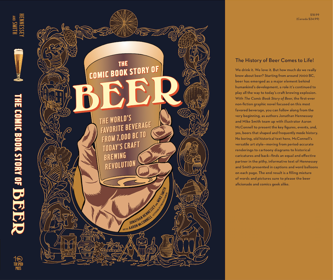
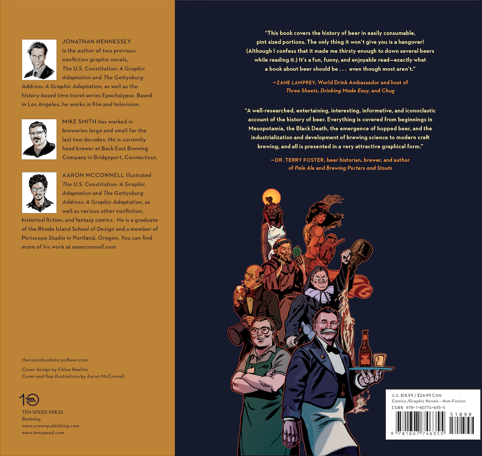
One of these satisfying moments is getting a look at your book cover once it’s finalized and bound for the printing press. The cover came our way today thanks to the modern miracle of email, the top-notch design sense of Chloe Rawlins and all affiliated staff at Ten Speed Press, and of course our trusty illustrator Aaron McConnell. Aaron conceived and executed all the “key art” elements like the engraved border. Those comics portraits were an eleventh-hour inspiration of his too.
Drum roll, please…
I’ve always found the task of creating covers — whether for one-off books or monthly comics “floppies” — to be a daunting challenge. There are so many things your cover is obligated to pull off: being visible and legible from a fair distance, imparting a sense of the what the project is all about, not looking too much like anything else out there, shoehorning in a lot of ancillary but required additional information… While simultaneously achieving the all-important goal of catching the eye and provoking the coordinated neural and musculoskeletal activity necessary to undertake that final step towards picking up the book.
We crunched through a whole lot of designs to get to this one. And now, looking back at those sketches, I’m glad we skipped over just about every single one of these lesser contenders.
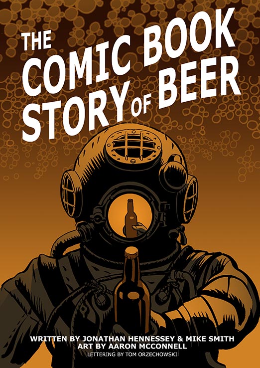
Aaron did, however, pony up one alternative early on that I will always hold some affection for. It was a risky direction to go. The visual metaphor didn’t strictly embrace any particular logic. But I found something wonderfully surreal about it:
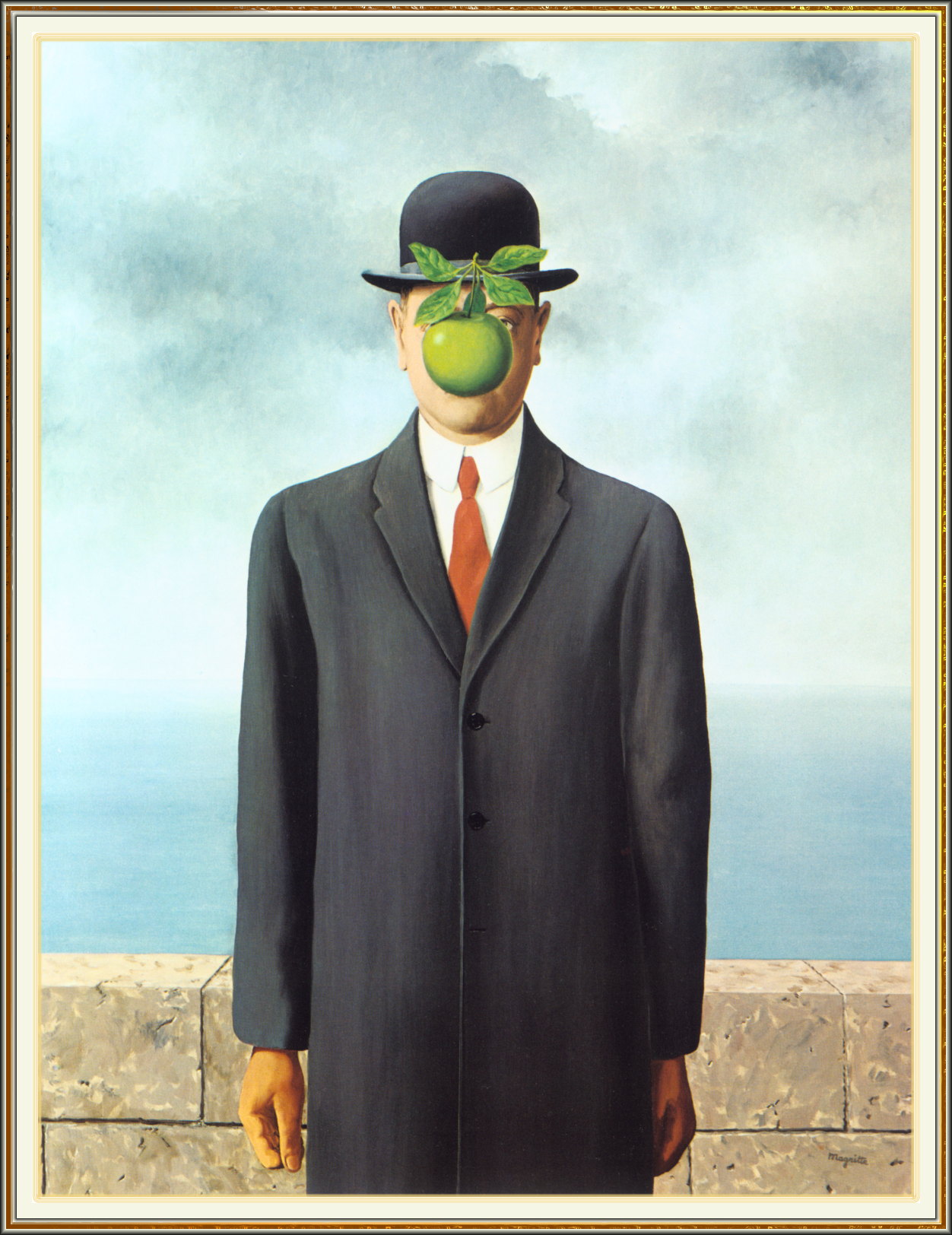
The effect, to me, wonderfully evokes the style of my favorite painter, Rene Magritte. See what I mean?
Come to think of it, there is more than a little Brussels, Belgium, in this book. As there very well should be, given Belgium’s unique place in beer history and appreciation.
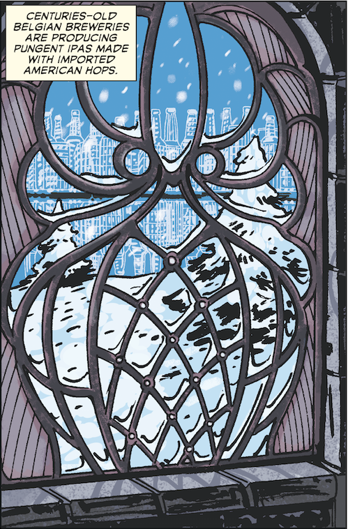
In Brussels, The Magritte Museum is just around the corner from the amazing Musical Instrument Museum. On the top floor of that building, which used to be a department store, there is a smashing restaurant whose Art Nouveau windows inspired this panel in the book:
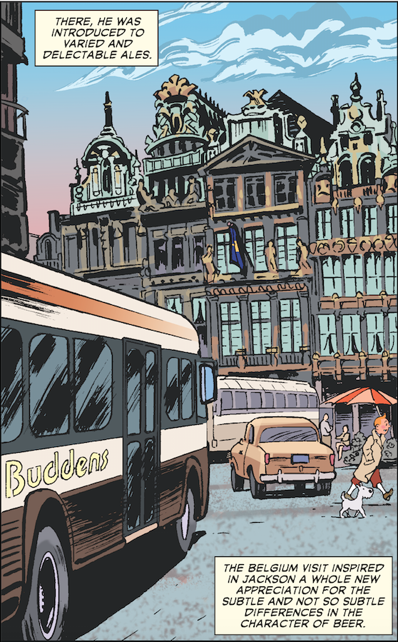
And Central Brussels’ Grand Place (as well as one of the city’s key fictional citizens) makes an appearance here on page 148. This main square of the city is home to the centuries-old headquarters of the Brewer’s Guild, and is well worth checking out.
Lastly, if there is one sublimely appropriate place to drink a beer and read a graphic novel (may I suggest this one), it would be at the Horta Brasserie: the in-house bistro at The Belgian Comic Book Center in Brussels. What a spot! Every lover of the genre should visit there someday. I really tried to work in an illustration of the place in this book. But facing some length constraints, the one we had planned had to be cut.
The Comic Book Story of Beer will be on sale in stores October 6, 2015. Don’t forget that you can preorder it now!

